Colour Contrast Checker
ID: #206974
Listed In : Business & Services SEO Services
Business Description
The Colour Contrast Checker helps you test how readable your text is against any background colour. It calculates the contrast ratio between two colours and shows whether the combination meets accessibility standards.
This tool supports designers, developers, and marketers who want to build clear, accessible, and user friendly interfaces.
What Is a Colour Contrast Checker
A colour contrast checker measures the difference in brightness between text colour and background colour. This difference is called the contrast ratio.
The tool checks whether your colour combination is readable for all users, including people with low vision or colour blindness. It also evaluates compliance with accessibility guidelines such as WCAG.
Good contrast ensures that content is visible, usable, and easy to understand across devices and lighting conditions.
Why Colour Contrast Matters in Design
Colour contrast plays a critical role in usability and accessibility. Poor contrast makes text hard to read and frustrates users.
Strong contrast helps:
-Improve readability for all users
-Support users with visual impairments
-Reduce eye strain on long pages
-Build trust through clear design
Accessible design is not optional. In many regions, it is also a legal requirement.
What the Colour Contrast Checker Does
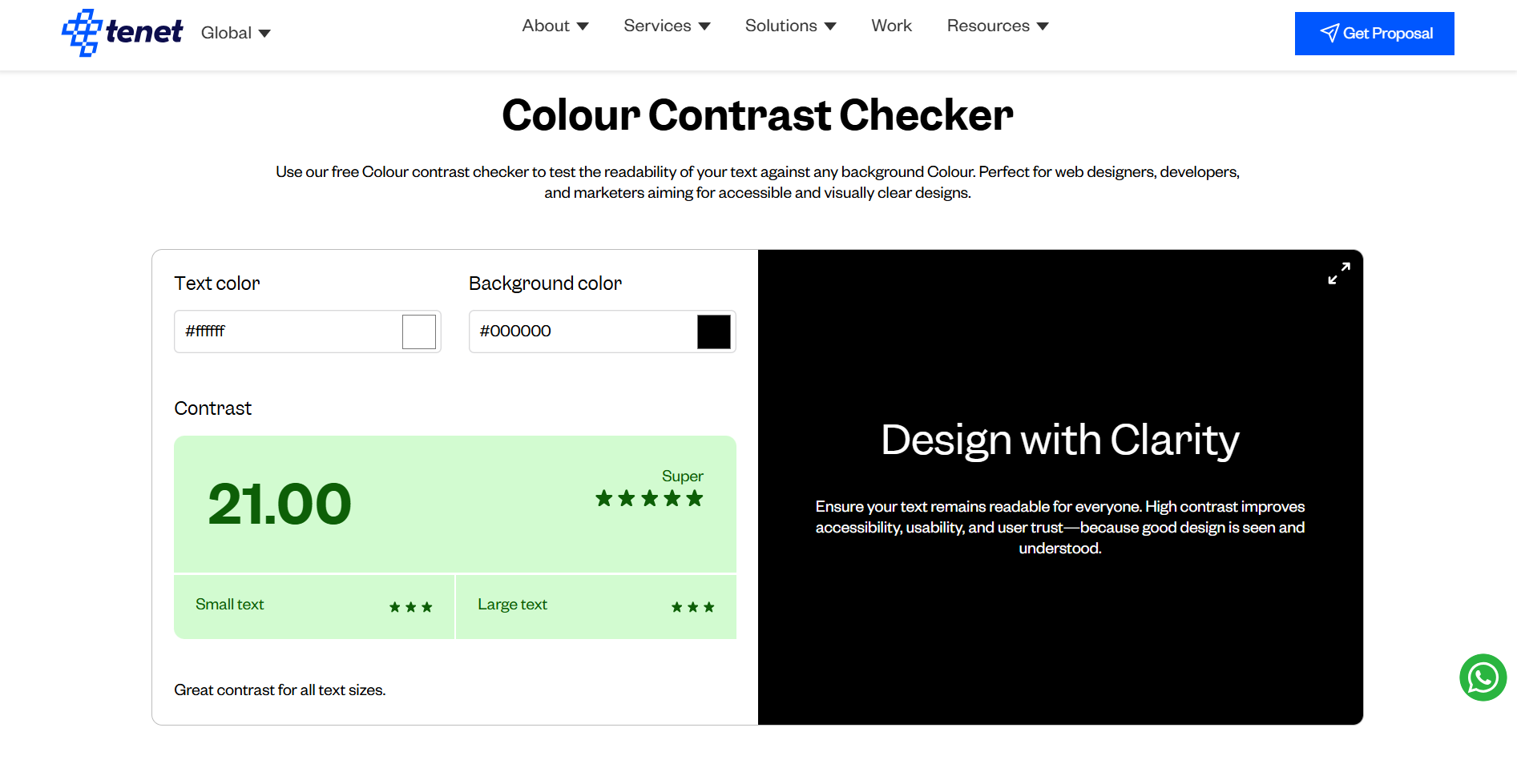
The Colour Contrast Checker evaluates your colour choices in real time and provides clear feedback.
The tool:
Calculates the contrast ratio between text and background colours
Shows a live preview of the colour combination
Displays a numeric contrast score from 1.00 to 21.00
Rates accessibility based on WCAG levels
Indicates whether the contrast works for small and large text
This helps teams fix contrast issues before publishing designs or code.
How to Use the Colour Contrast Checker
Step 1: Input Colours
Enter the HEX code for your text colour and background colour.
Step 2: View Live Preview
See how the colour combination looks in a simulated interface.
Step 3: Check Contrast Score
The tool displays the contrast ratio instantly.
Step 4: Review Accessibility Rating
Check whether the colours pass WCAG AA or AAA standards for small and large text.
Step 5: Adjust and Finalize
Modify colours until you reach a strong contrast score. Copy the final HEX codes for use in design or development.
Understanding WCAG Contrast Standards
WCAG defines minimum contrast requirements to ensure accessibility.
Key benchmarks include:
-4.5:1 for normal or small text at AA level
-3.0:1 for large text
-7.0:1 for AAA level accessibility
Meeting these standards improves inclusivity and reduces accessibility risks.
Key Benefits of Using the Colour Contrast Checker
Improves accessibility
The tool ensures your designs work for users with visual challenges.
Enhances readability
Clear contrast makes text easy to read on all screens and environments.
Supports compliance
Helps meet WCAG accessibility requirements.
Improves user experience
Readable content keeps users engaged and reduces frustration.
Helps SEO performance
Accessible and user friendly design supports better search performance.
Who Should Use This Tool
The Colour Contrast Checker is useful for:
UI and UX designers
Web and app developers
Marketing and growth teams
Product managers
QA and accessibility teams
Anyone responsible for digital interfaces can benefit from proper contrast testing.
Good design must be seen and understood by everyone.
The Colour Contrast Checker makes accessibility simple by giving instant feedback on colour readability. It helps teams design with clarity, confidence, and compliance.
If accessibility, usability, and trust matter to your product or website, this tool should be part of your regular design workflow.
Business Hours
Monday : 00:01 - 00:00
Tuesday : 00:01 - 00:00
Wednesday : 00:01 - 00:00
Thursday : 00:01 - 00:00
Friday : 00:01 - 00:00
Saturday : 00:01 - 00:00
Sunday : 00:01 - 00:00